
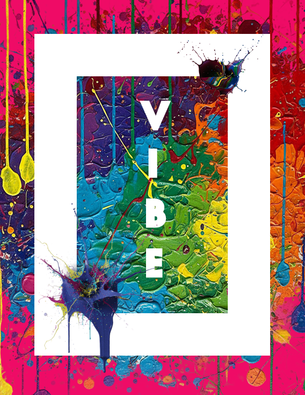
vibe
Vibrant • Curated • Community
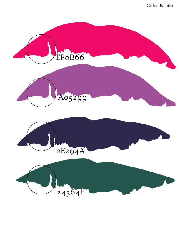
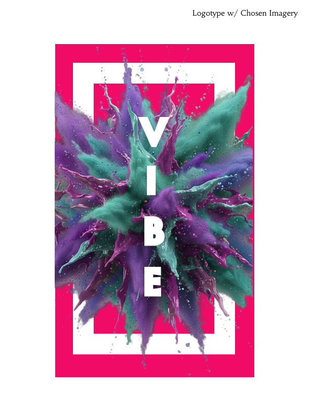
Vibe is a creative space uniting the community over coffee, cocktails, and exhibitions. The VIBE brand identity lies in its daring yet calculated fusion of structured sophistication and unleashed creative energy. It successfully manages the duality of the space - a sophisticated gallery/cafe by day and a vibrant cocktail lounge by night- by employing a visual strategy of controlled contrast. The foundation is built upon a clean, gallery-worthy structure: classic serif typography, a clear grid system, and a deep, refined neutral color pallet (indigo, cream, charcoal). However, the “VIBE” is injected through a dynamic accent layer, utilizing bold, expressive color splatters and high-contrast textures as subtle graphic overlays or rotating feature colors. This creates a visual experience where refinement frames rebellion, allowing the brand to signal credible artistry and approachable, colorful spontaneity, ensuring the identity is always as curated as a fine art exhibit yet as invigorating as a craft cocktail.
TYPOGRAPHY & TONE
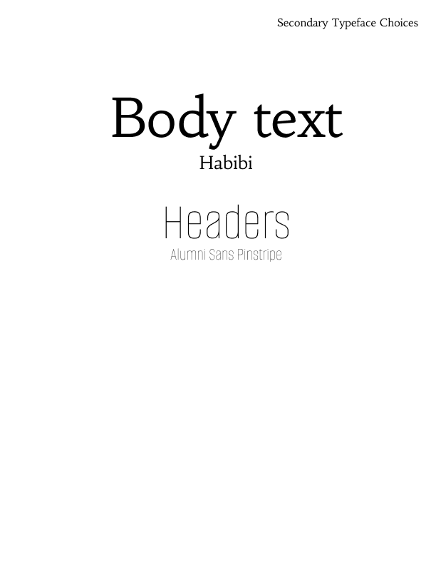
• Pair a serif with a clean, geometric sans-serif for body text and menus (Montserrat or Futura).
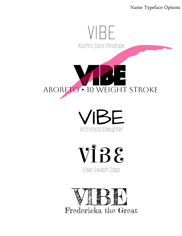
• Use sharp, classic serif typeface for the main logo, headings, and physical signage. This lends credibility and a sense of curation (Baskerville or a modern interpretation).
• For cocktail specials and unique coffee names, consider a hand-drawn or stylized script to give a more personal, hand-crafted feel.
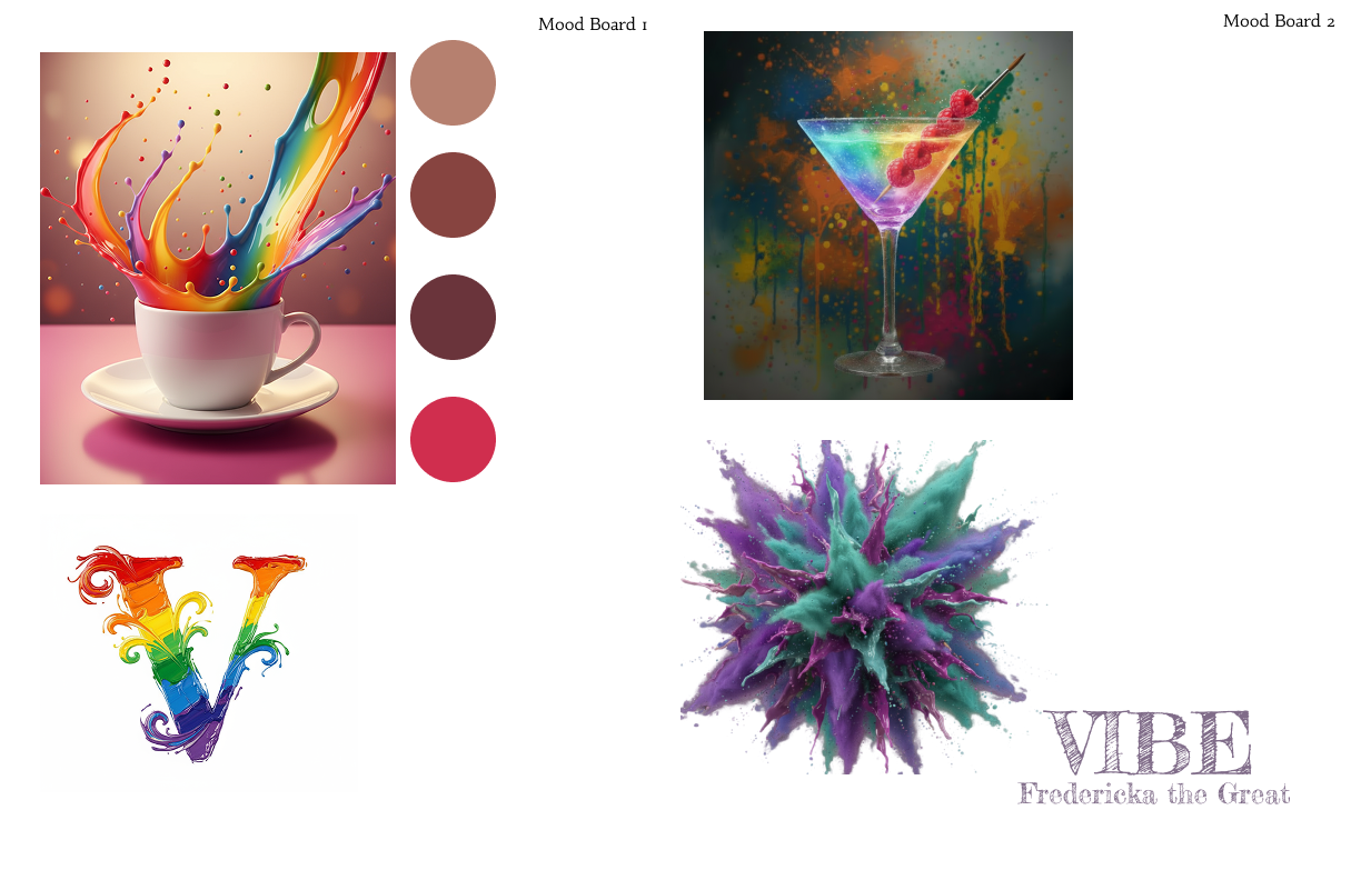
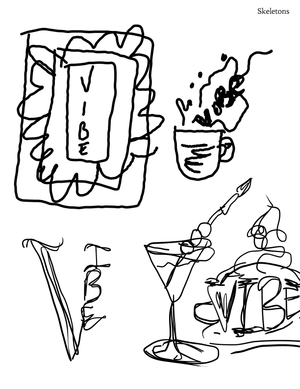
mind mapping & Brainstorming
MOOD & ATMOSPHERE
• Daytime (coffee/gallery): Sophisticated serif fonts and neutral bas colors dominate, but a hint of the “vibe” can come through in carefully curated accent pieces or digital displays promoting current art.
• Evening (cocktails/gallery): Richer, darker colors like deep indigo can be paired with vibrant splashes. Lighting can be used to highlight art with a more dramatic flair, and cocktail menus can be more expressive.